Written by painting conservator Danica Mészárosová.
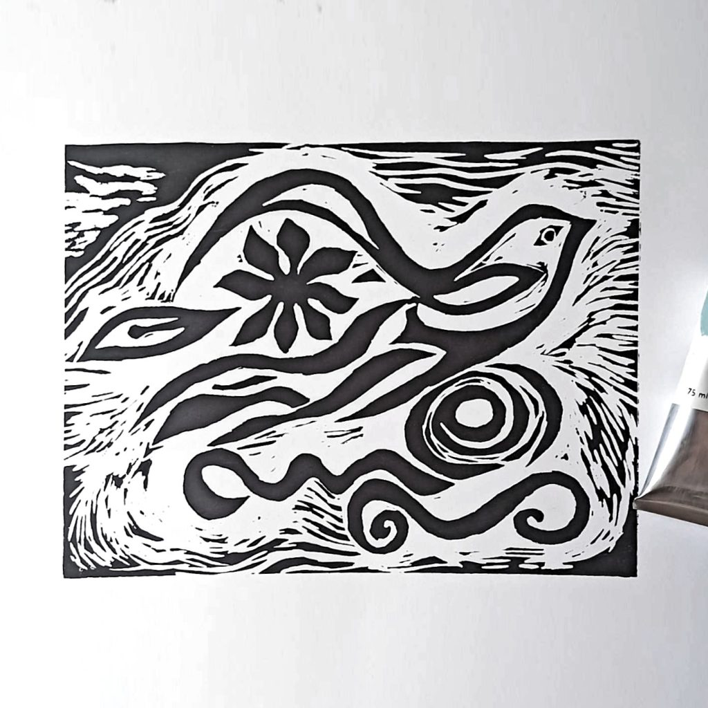
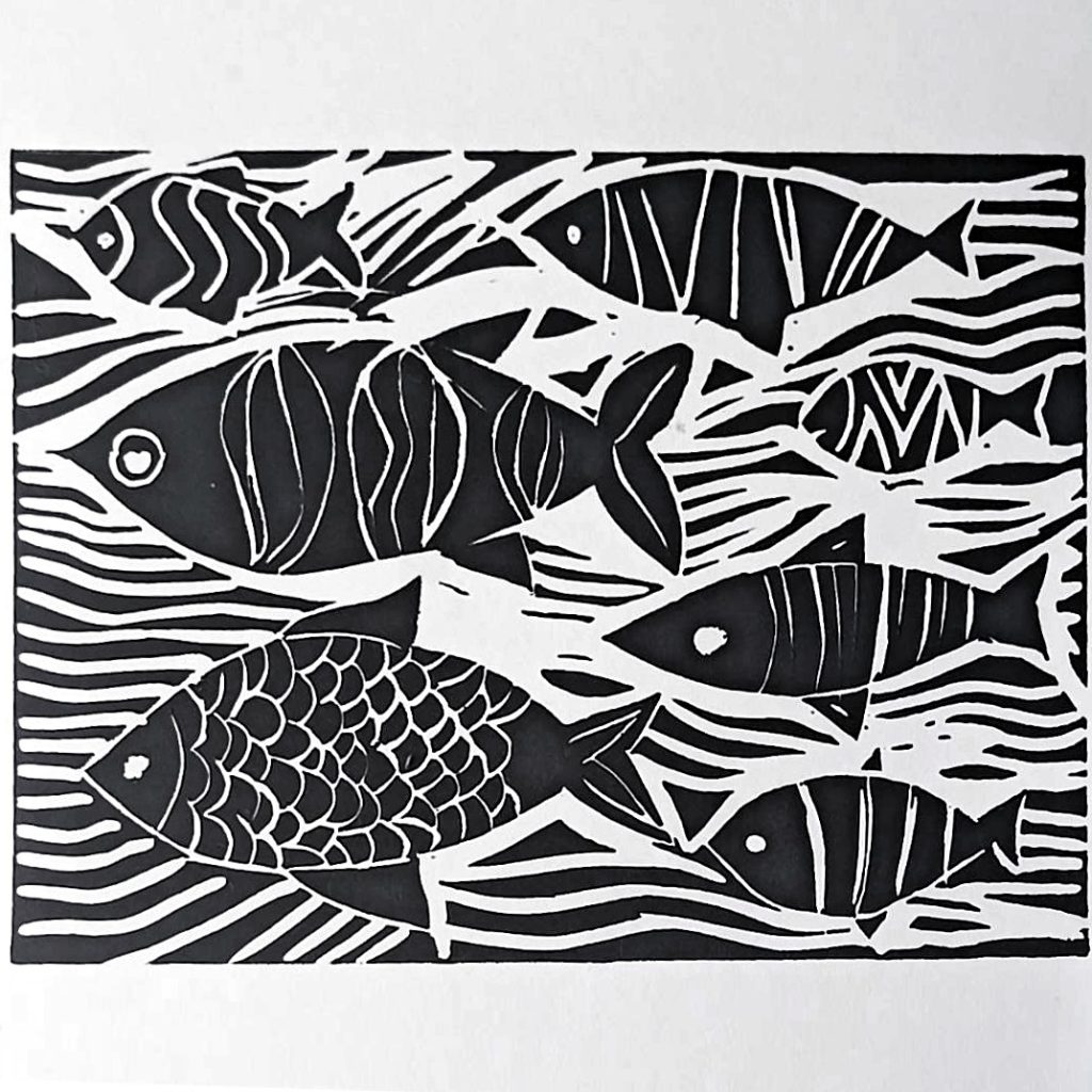
Linocut, or traditional woodcut print, is commonly associated with black color, historically the dominant color.
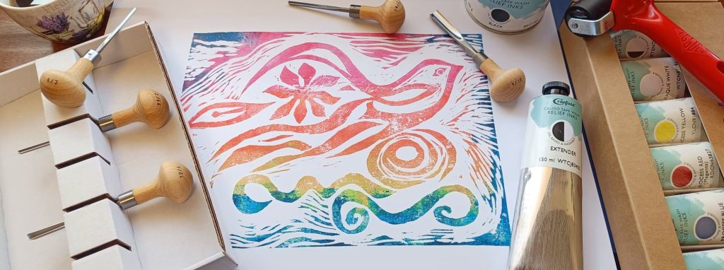
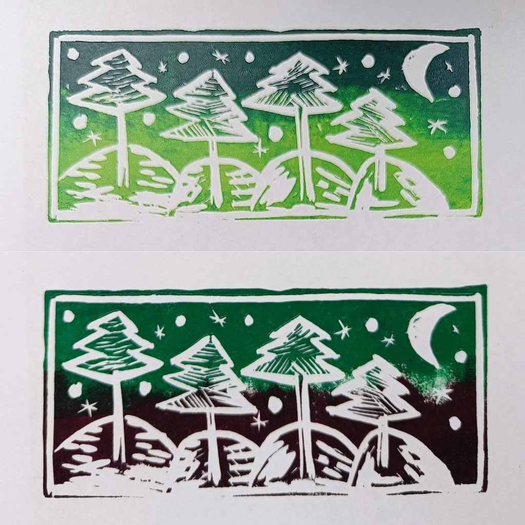
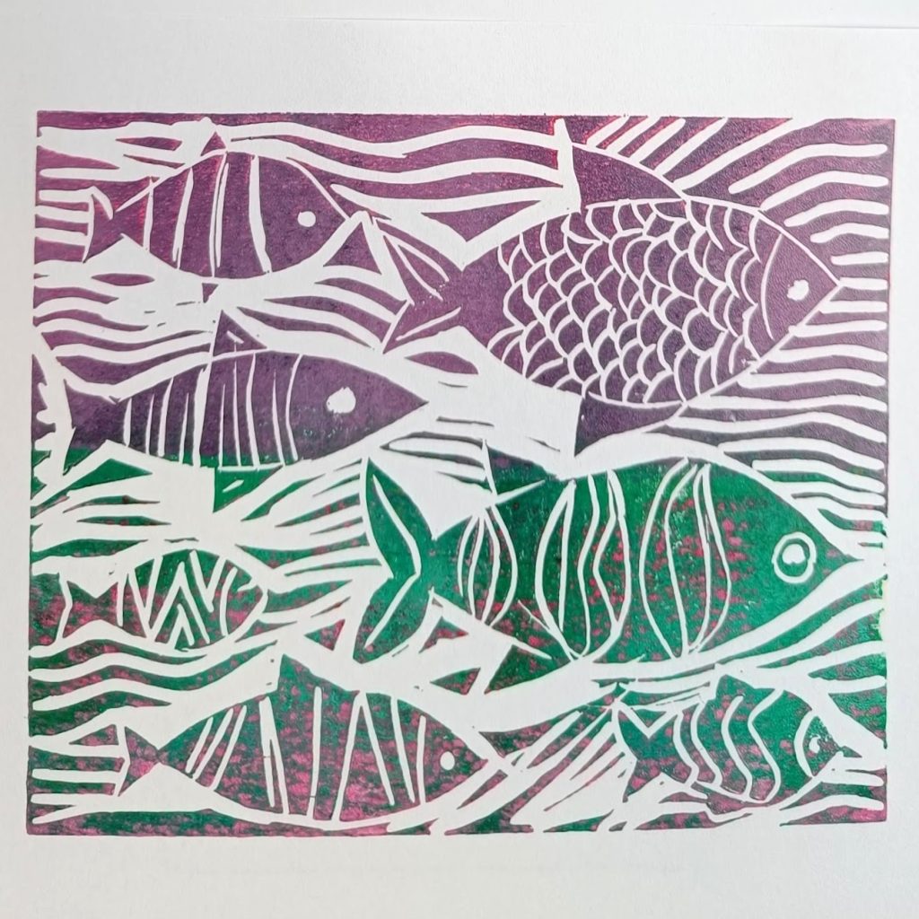
Thanks to high-quality inks, prints no longer have to be “boring” black. Artists can expand their range of expression beyond just the carving itself—which defines the areas filled—to include the expressive power of colors and its transitions, whether smooth or sharp.
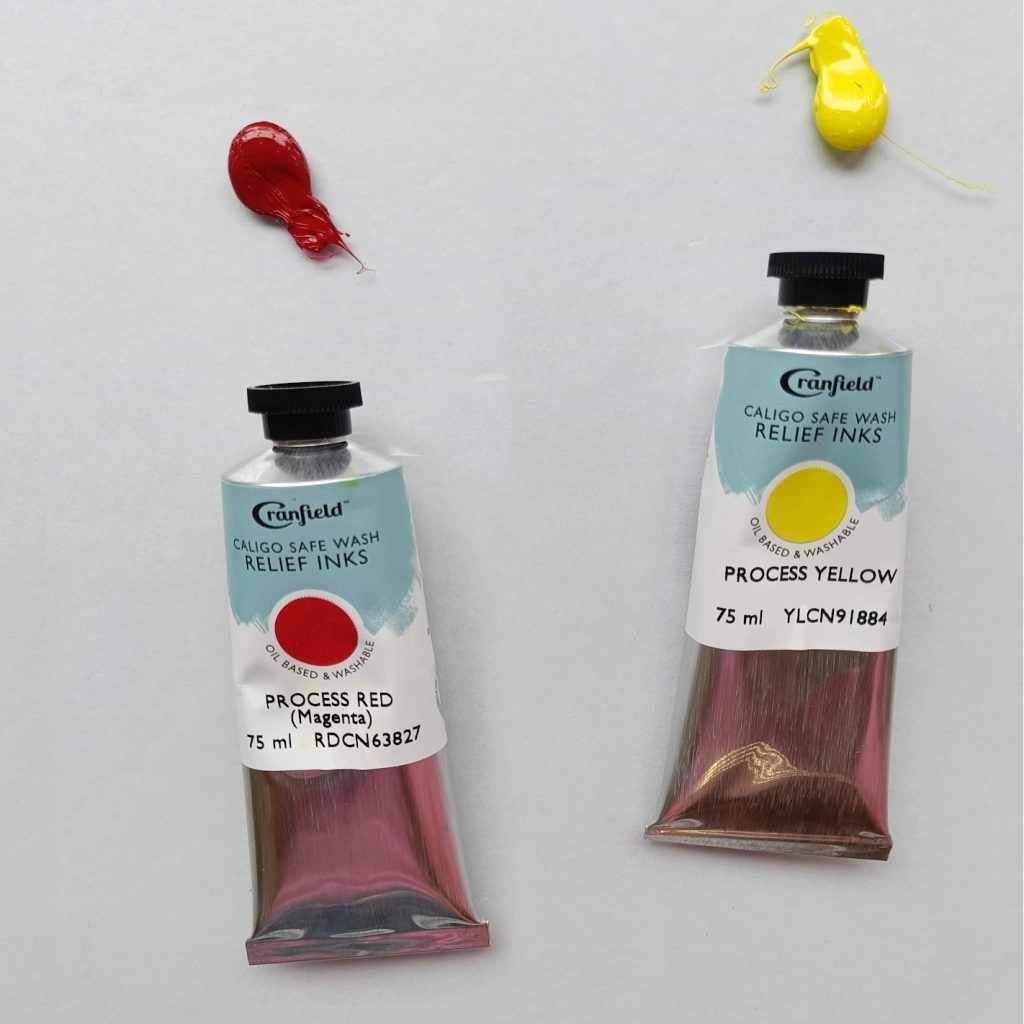
By mixing colors, we can create a full spectrum from basic colors. With a bit of practice, we can tailor the final appearance to match the artistic intent, enhancing the experience of printing by giving the final print its distinct tone or mood during the last phase—the printing itself. Cranfield relief inks dry slowly, giving us plenty of time to prepare and work with our own palette. For mixing colors, a smooth glass surface backed with white paper is ideal. To apply the colors and create gradients, I used a 75 mm wide roller. For larger prints, it’s practical to use a wider one.
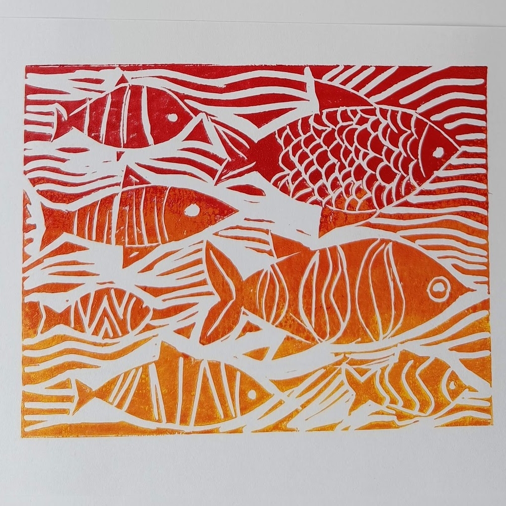
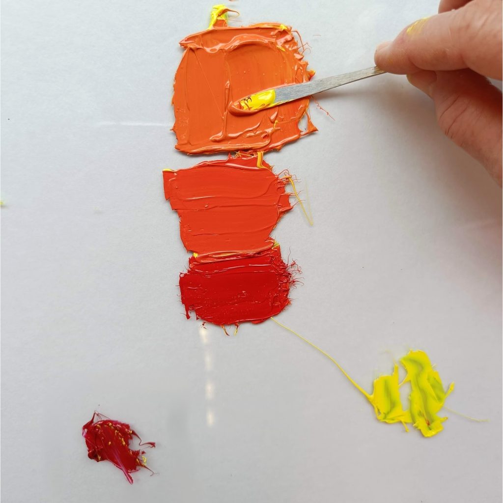
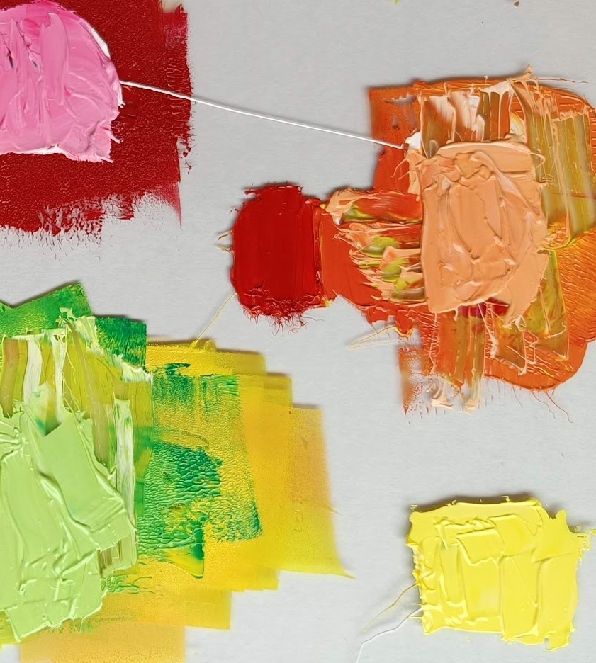
Red and Yellow
In the first example, I use only red and yellow, and by mixing them in different ratios, I create the secondary color orange.
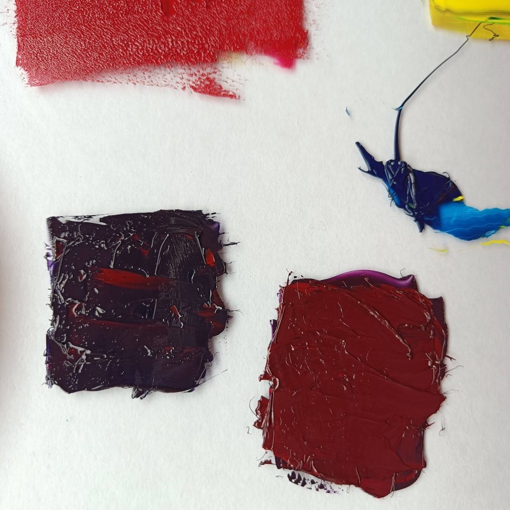
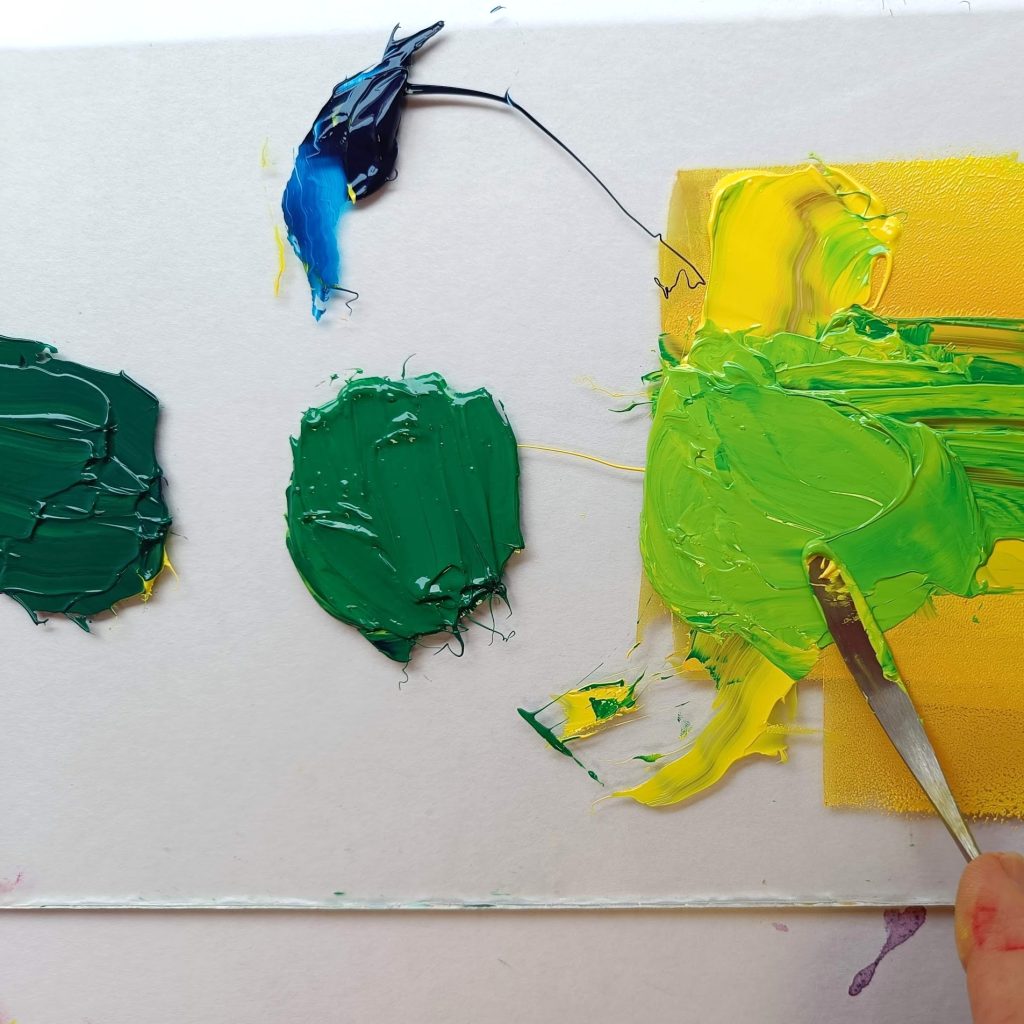
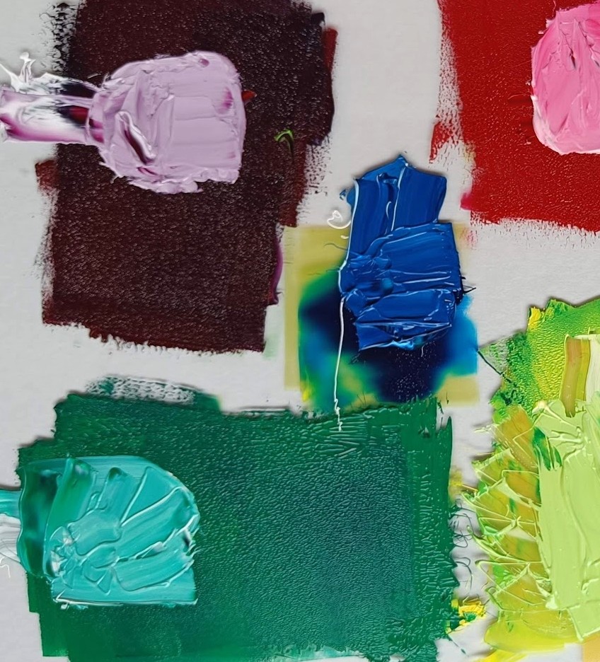
Adding Blue
By adding blue, the print gains depth. I can now create the secondary colors green and purple. The richness of the pigment and the opacity are characteristic of high-quality inks, which expands both the range of the palette and the expressive potential of the artwork. The inks also allow for variations in the final image—one print series can contain multiple color versions.
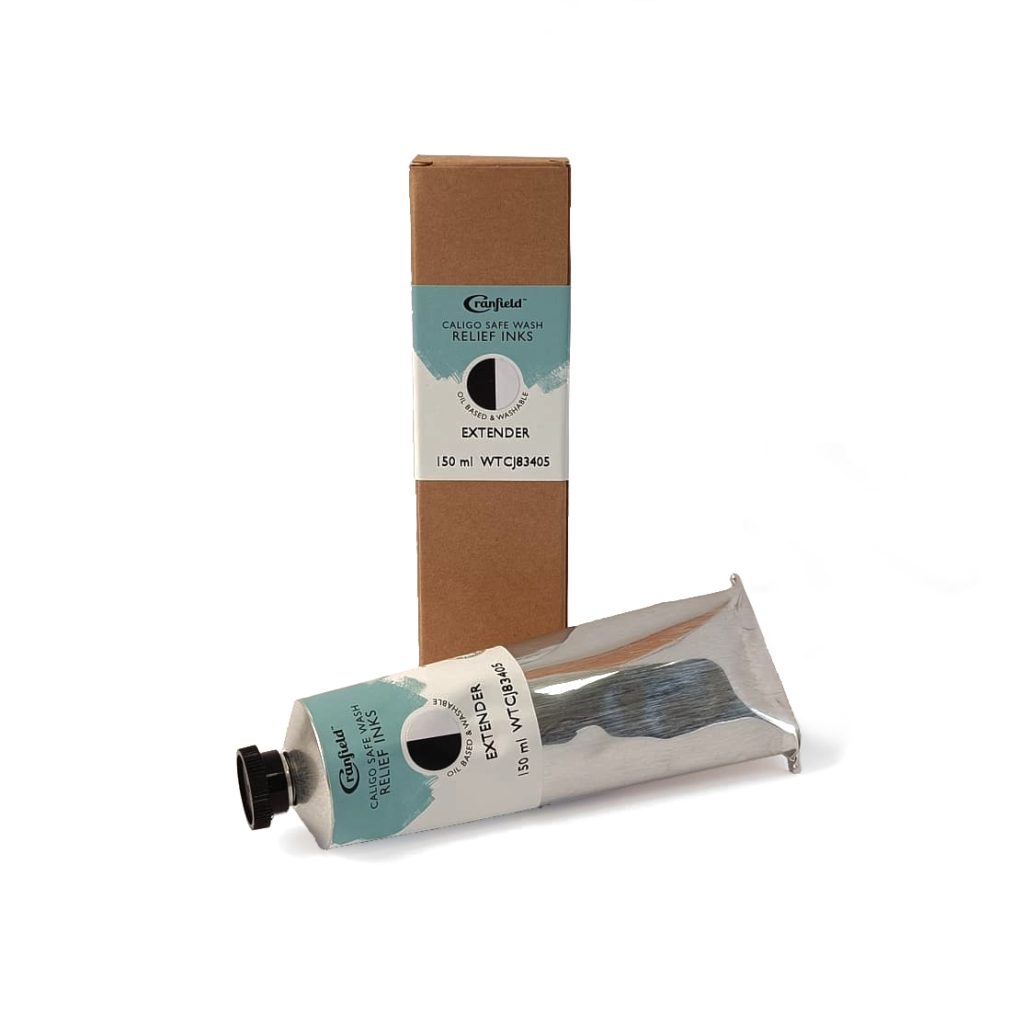
Opaque white can be used to soften color intensity. When mixed in, it creates pastel tones. In addition to white, the set also includes an extender—a transparent filler that reduces the opacity of the paint, allowing the background to show through more clearly. This can be either the color of the paper or a previously applied layer of paint, especially when printing in multiple layers.
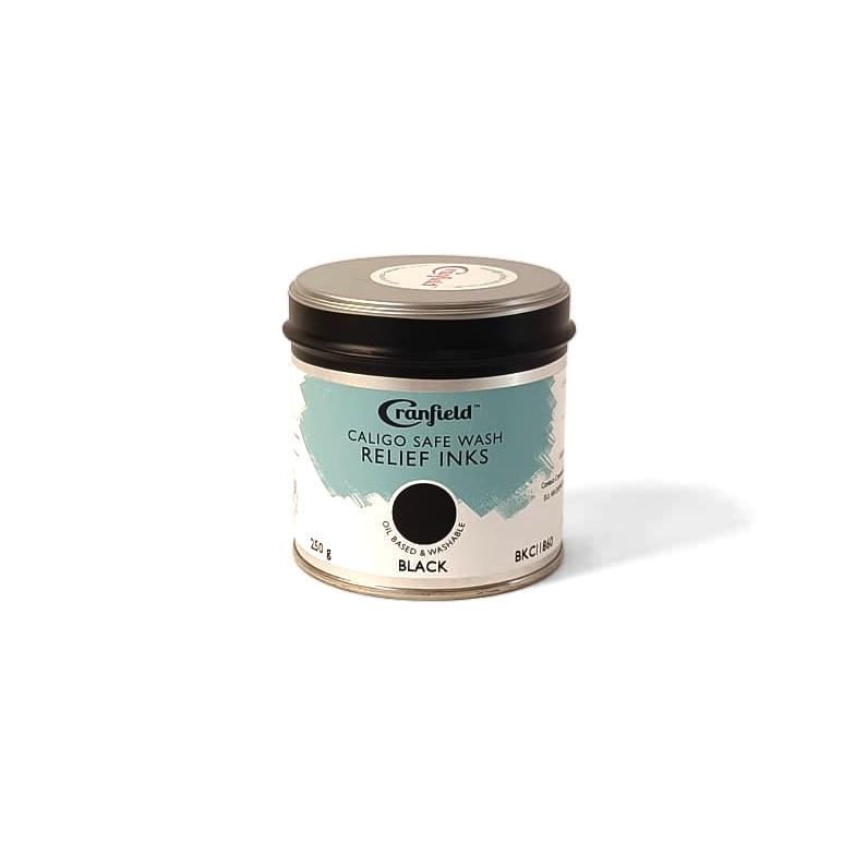
The PROCESS colours inks also includes an opaque black. In graphic work, we’re often used to a dark, black-dominant look, but vibrant, high-quality colors offer much greater expressiveness when shaping the final mood of the artwork.
Conclusion
Mixing colors is an alchemy. So don’t be afraid to experiment—it may lead you to unexpected discoveries. Working with color is intuitive because we’re used to perceiving it subconsciously.
Maybe mixing colors will inspire you to notice the colors around you in everyday life—they are just as vibrant, rich, and deep.
Next time, we’ll demonstrate how to print using multiple colors applied in layers, gradually removing areas from the printing block. M-stein graphic tool set would be great companion on the way to enjoy playing with colors.
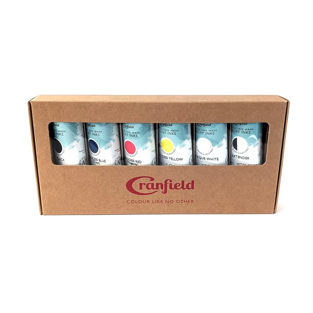
If you prefer pre-mixed over primary colors, we also offer a Soft Shades ink set, of tercial colors prepared by the manufacturer. All SafeWash relief inks use high strength traditional Linseed formulations.